Thursday, February 2, 2012

Exhibit C - Sunny Days


Well, I did it. I got all four cards made for the Verve January challenge. Ironically this was the first sketch in the series. I did everything backwards - what else is new.

Here is the sketch. You can go to Splitcoast Stampers Gallery here to see all the other entries. There are lots of beautiful cards and many interesting variations on the sketches.

The patterned papers from K & Co were my starting point. The base and mats are chocolate chip (SU). The crochet trim and the antique brads are also SU. The crochet lace circle under the label was some by-the-yard trim I bought at Joanns. I stitched a running thread through the bottom edge and gathered the trim to make the circle. The stamps are from the Verve sets 'Tag Time' and 'Let it Shine'.  I stamped the label outline, then the words (both in chocolate chip) on some of the background pattered paper, and trimmed around  it by hand. finally, I set the label stamp down on the green pattered paper and, with a pencil and small  washer, traced around the stamp to create the mat. This, I also hand cut. I added some thin cardboard behind the whole label section to give it a bit more body, then attached it to the card with foam squares.

Oh yes, I sponged some vintage photo distress ink around the edges of every piece of paper before putting anything together.

Well that is it, and I may not be doing many posts for the next little while. We have a quick trip to make for a family emergency, then home to pack and leave for AZ and many sunny days. I will have to see how it goes with the computer time. Meanwhile,you all keep on stamping.

Wednesday, February 1, 2012

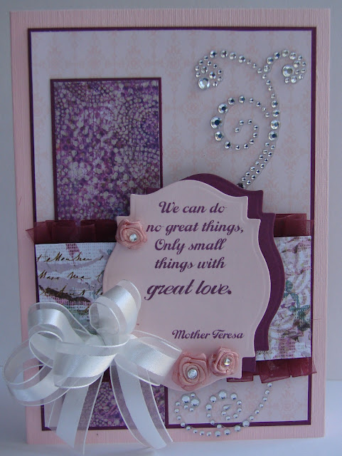
Exhibit B - Great Love


I have the third of four cards finished for the Verve Challenge. My colours on this card are pink pirouette and rich razzleberry. Here is the layout from Verve.


I began with the two beautiful papers from K & Co and chose my palette to match. The background patterned paper is from SU, which I matted with the razzleberry and attached to the card base. I also matted the vertical band of dp with razzleberry (I should have used a paper with a shorter name!)

I wanted something a little different for the horizontal band mat so I went to my ribbons and found some organdy that matched. However, I felt I wanted something a little more solid so I decided to pleat it. Hmm. It took a little work, as I chose to do it by hand, not on a sewing machine, but I managed to get a look I liked.

The label and mat are the same size, die cut with SP #18 label die and offset. The sentiment was created on my Office Word and printed on the pink label. The flowers, from SU, are ivory in their original state, so I died them, then added the rhinestone centers with crystal effects. I also used the CE to attach the flowers to the label. The beautiful ribbon is also SU (I tied the bow together using a small bit of fine wire, then attached it with a glue dot) and the crystal swirls are Recollections from Michaels.


This one took a while to come together, but I am please with the results. Hope you like it too.

Sunday, January 29, 2012

Verve Challenge Exhibit A


Hello fellow bloggers. I seem to be on a new kick. I have designed cards for a second challenge, this one for Verve. This is only my second time to enter a challenge. The two cards on today's post are layouts #3 and #4. I plan to get the other two layouts done and posted early next week.


This is layout #3. and here is my card. The patterned paper is K & Co, and the  teal card base and butterfly base c/s is Core-dinations. The card size is 5x7". The chocolate and white c/s as well as the chocolate satin ribbon are all SU. I die cut the rectangle with an SB lacy rectangle and sponged some teal ink on before removing from the die. Then I lightly stamped a floral spray on with light plum ink and the Stampers Anonymous words with chocolate ink. The ruched ribbon was created by attaching a long piece of sticky strip to the card, then attaching the ribbon at one end and randomly scrunching and sticking it down as I worked across to the other side. Clear as mud? The butterflies were die cut with SU's beautiful butterflies Bigz die. The antennae are a single floral stamen from Michaels. The pearl body and swirls are also from Michaels. Finally, the row of tiny pearls on the rectangle (popped up with double foam squares to fit over top the ribbon) are from SU.


Here is the sketch for week 4, a CAS challenge. I did try to keep it clean and simple but because of the rather fancy flower, my card might not be considered CAS. I had the flower sitting on my desk from last November - see my post about it here. So I decided to finally use it in a card. I chose lucky limeade and brilliant blue from SU as my accent colours. The trim and label are both die cut using SB's lace doily accents die set. After rifling through my huge stash of patterned paper unsuccessfully looking for something to coordinate with these two colours, I had a light bulb moment. Why not make my own designer paper? So I use some pre-embossed paper from SU and sponged on ink to match. After a bit of buffing, the embossing shines through and voila, a perfect match. The phrase, stamped in brilliant blue ink, is from Verve, appropriately enough. Because the flower was already made, this really was a quick card to make. It only took me about 1/2 hour which I have to say is a record for me. Well, off to do some housework - where is that maid when you really need her! I hope you get your fingers inky today.


Thursday, January 26, 2012

Non Traditonal

A quick post today. This card will be an entry for the Paper and Such 'non-traditional' challenge. It is also the challenge at Ribbon Carousel. You are asked to make a card using colours that would not be necessarily expected, and also use some type of ribbon or fiber 'that comes on a spool'. That is a very open challenge and I remembered this card I made a while back that really fit the bill. Sorry that my picture is a little tilted.


I stamped a design and also applied ink direct-to-paper using mustard ink on mustard c/s. Then I ripped the paper diagonally and distressed the edges with more mustard ink. I applied a strip of self adhesive copper coloured mesh to a brown card base, then attached the two pieces of c/s. On a copper metal tag I began adding layers of copper EP and when I had built up several layers, I pressed a stamp into the EP while it was still hot. Then I punched 5  holes into it with my crop-a-dile and  attached copper brads to 4 of them. I stamped the keys on mustard c/s and fussy cut them, then tied them to the tab with some copper cord and some tan and brown embroidery floss.Then I attached the tag to the card with sticky strip. That is about it, a Valentine with no red or pink on it.

Wednesday, January 25, 2012

When My Batteries Fail


Usually I am complaining that my memory is failing but yesterday it was my camera batteries failing that had me stopped in my tracks. I got this card made in the morning but when I tried to get some pictures, the batteries were dead. So I went to the charging unit to get the second, presumably charged and ready set, only to find that they, too, were lifeless.

I decided, while the battery situation was getting corrected, to get the info on this creation written up before my memory failed me as well and I forgot what products I used.

I knew I wanted to work with the Fancy Labels stamp set from JustRite and the #13 label die from SB. I stamped the pretty label on white c/s with Versamark, then heat embossed using SU's wild wasabi EP. After die cutting it, I coloured in some areas of the design with a wisteria marker. None of the oval dies I have matched the center oval area of the stamp, so I hand cut an oval and stamped a sentiment from Fiskar's Friends Forever Quotes stamp set using wisteria ink. The Fiskars set is clear acrilyc and did not seem to want to take the ink well, so I ended up going over the stamped sentiment with the marker. Then I cut one more label in the largest size for a mat, and put all three pieces of the element together with foam squares and dimensionals

The patterned paper is from the Bright Blossom collection by s.e.i. This paper has some very pretty glitter which I hope showed up in the picture. I cut a rectangle of wisteria c/s for a mat and punched around the border with SU's Scallop Trim border and corner punch set. Then I attached everything to a white card base and added a bow of white seam binding using glue dots.

Of course the inside got a treatment as well and I can add any words I want above 'true friend' to suit the occasion  - I just have to remember what colour ink I used! I may have to pencil it in in case I am in a big hurry and don't have time to come back here to find the info. That is usually the case; me getting a card ready 3 minutes before we go out the door. Of course, I know none of you would ever do that.

Okay, back to the sewing machine for one more day. Then I may try a card with sewing on it. I love the shabby chic effect that gives. See you again soon.


Friday, January 20, 2012

Thoughts of Travel


The patterned paper in this card is part of a number of coordinating papers that I came across in a shop in the Phoenix area last November. It practically reached out and grabbed my arm as I walked near. It has a definite East Indian/SE Asian theme and the colours are just so rich and vibrant which, sadly, does not translate to the photo. It turned my thoughts to that part of the world which I hope some day to visit. I wish I could attribute these wonderful designs to the company responsible for them, but alas, said company did not see fit to print their info on their papers. Seriously? You want me to remember that info from 2 months ago? I doubt I remembered it by the time I got into the car that day!

The c/s for the base is Bazzil - a lovely shimmery textured c/s which I also used for the label and the floral motif. The mat and bottom layer of that motif are SU's teal. As to the wonderful shiny fuchsia c/s, I am again at a loss. I used SB's lace motifs and accents dies for all the trims and motifs. The pumpkin satin ribbon is SU as is  the stamp which I went over with a sharpie because it is difficult to get a sharp image when stamping on textured c/s.

The final touch was the beautiful antique looking gem brad by Creative Charms.

You mustn't forget the inside of the card.

I have to add that every time I look at the words, visions of the Golden Girls flash through my head. I can't get that song out of my mind now.

I have lots of this wonderful paper left and I am sure you will see it again soon.

Thursday, January 19, 2012

Ain't Misbehavin'...


Well maybe a little. I did get one of the sewing jobs done that was on the list. The rest are patiently waiting for me while I make cards. 


My card today is made using designer papers from a pad by Die Cuts With a View called Global Treks. It does have a bit of an exotic feel that called to my wanderlust.

I began with a 5x7" card base made from SU's naturals ivory. The trim, smaller mat and back layer of the medallion are all from a textured c/s that may be Bazzil (?).The colour is Sandstorm - more thoughts of places far away. The red layer of the medallion is SU's Red Riding Hood. I uses SB's Parisian Accents and Motifs dies to cut the trim and medallion. All the design paper is DCWV and I added some golden 'rhinestones' and raised the medallion with dimensionals.


Oh yes, I forgot that I used a Mojo Monday sketch as a guide line for the layout. Notice I used the word guideline, but then, that is what they are there for.