Tuesday, August 14, 2012

More from My Digital Studio

I am finding it hard to find time to get to my blog these days. Currently, I have my granddaughter here for a second week this summer. It is a joy to have her here. She loves to craft and is working on a scrapbook at the ripe young age of 6.

I will show you two cards today, and I will not comment so much on every item I used, but on some of the great features of the MDS software.

On this first card, I started with the medallion in artichoke, then added the border on the right. Next I created the 'label' on the bottom right with two oval punches layered, then two modern label punches layered. The words were created with a text box and a font I had on my computer. This is one great thing about MDS - any fonts you already have on your computer will automatically be moved into the program. I added the 'brads' and then left the design as it was for a couple of weeks. 

When I came back to the design, I decided I wanted more overall coverage, so I added the vintage overlay digital stamp, reduced the opacity to 1/2 (another very useful feature) and moved it back until it was under the label but still on top of the medallion and border. The other colour I used for the brads and one of the ovals was rich razzleberry. I am not a big fan of the digital embellishments like the brads and next time, I will probable use real brads instead. It would probably have helped if I had added a drop shadow to the brads for a more realistic look. The rest of the card I am quite satisfied with. 

I printed the card front on whisper white c/s  and trimmed it, leaving a 1/4" border of white. I made a 5x6 1/2 " card base from razzleberry c/s and attached the front. Finally I added the satin razzleberry ribbon.


For the inside, I used just the border and the vintage overlay. The great thing is, I have this project saved now and can reuse it, changing the sentiment as needed. This is such a great time saver when you find yourself looking for a card at the last minute.

The second card is a recreation of a template that you can buy from SU ready to use. I did not like the face that the white areas were actually vanilla on the original, so I used the daydream medallion stamps that come with the template to make my own version. 


 This is a fairly acurate copy of the original. I made one medallion group, minus the mustard center design, then 'grouped' it and copied and pasted it three times.

Then I added the centers to the medallions.  For the 'thanks' medallion, I added a label punch, colour filled it and layered the word on top. A drop shadow makes it look like the label is popped up on dimensionals.

The rhinestone brads are real and attached after I printed and trimmed the card front.

Colours used were mustard, white, olive, marina mist, and navy. The navy mat and mustard card base are SU c/s. As you can see, I am lucky that my printer puts out colours that are a very close match to SU products.


I know there is a way to copy this whole page, paste it on another page and reduce the opacity so that I can print a message over it . I have to work with this program more to learn more of the features.

I have a couple of earlier posts which feature MDS here and here, if you want to see them. On the first one, Holiday Bells, I misspoke when I said it was my first foray into digi stamps. In fact, what I meant to say was my first time to purchase a stamp elsewhere than Stampin'Up!. If you have MDS and you purchase stamps elsewhere, you can load them straight into the MDS program and have instant access to them.

Okay, it is time to go spend more time with a very patient 6 year old.. 


Wednesday, August 8, 2012

My Digital Studio

As I mentioned in my last post, SU has just released a new version of My Digital Studio - MDS2 and MDS2+.

For those of us who already owned the original program, we were able to download an upgrade for our existing software. It has some wonderful improvements and I went to town playing with it. I am not a big fan of digital embellishments however, so I make my base on the program, print it on white or vanilla C/S and then make a hybrid card with real embellishments added so my cards are still 3D.


The first one is a very simple shower card for my niece-to-be, Ashley. The wedding colour theme is green, white, and black, so I stayed with those colours. For the base I created my own pale green shade using the RBG palette in the design center. It is closer to the colour of the wedding invite. Then I saved this shade in 'my favorites' so I can use it again when I make their wedding card.

The digital stamp set is called Wedding Sweet, and I placed two 'small flowers' on the base and altered the colour to artichoke. Then I added the greeting in white and again in black, moving the black one to the back of the white like a drop shadow.

I printed the finished card front on white c/s and trimmed it to fit a 5x6 1/2" card base. Then I added SU pearls and a bow made with SU ribbon.

Inside, I again used the green base, added two smaller versions of the 'Small flower' and added a text box with my own words typed in.

One interesting side note on this; I was talking to someone in the IT department at SU a few days ago, and in the course of the conversation, I happened to question the white area created when adding the 'small flower' stamp to a project. Maryann realized that this is a glitch so she spoke to the design team and apparently it has since been fixed. I have to download the newest version now, but it is cool to have been the one to discover the error.I really feel like a team member now.

Post script; I did manage to download the improved digital stamp set - 'Wedding Sweet' and the little white space glitch has indeed been corrected. I have gone back and fixed my project so the next time I use it, those white spaces will be gone. So cool.

Tuesday, August 7, 2012

Regarding Age....

This card is a complete CASE from my friend, Lisa's card on her blog here. I loved the colours she chose and stayed with that same palette.

I decided on a square card because I had some purchased black card bases in my stash. The background paper is from Graphics 45, as is the sea horse tag on the lower left.


The three die layers in vanilla and black (SU cardstock and some textured Coredinations ivory) are Spellbinders; Floral ovals and Fleur de lis squares.

I created the sentiment on my computer using two different fonts and printed it on to the vanilla cardstock before cutting it with the die. As you will notice, this is completely CASEd from Lisa.

The pretty flower is by Spare Parts, and all the pearls are  by Recollections. The brad  (Vintage by Creative Charms - avail. thru Heartfelt Creations) originally had a gold rhinestone in the center but I popped it off and replaced it with the pearl. A touch of vanilla organdy ribbon was the final touch.

Inside, I added a square of the textured ivory C/S and a band of the patterned paper.


I will be back again soon, as I have been playing with my newly upgraded MDS from SU and have several computer hybrid projects to show you.

Monday, July 16, 2012

Summer Blooms

That is what comes to mind for me with this card. I picture my friend's garden out on Vancouver Island, where you don't have to nurture things to keep them going, and everything is lush and verdant. Beautiful gardens filled with hydrangeas, peonies, giant hostas.....but I digress. My simple attempts at gardening here in central Alberta reflect  our local sandy soil, the ongoing battle to keep the deer away, and my distinct lack of a green thumb. So I have to create my gardens on paper.

This card began, as it often does, with the patterned paper by My Mind's Eye. I love the soft aquas and lilacs. I matted it with orchid c/s (a retired SU colour) and attached it to a 6x6 white card base. All card stock here is from SU.

The medallion has a bottom white lacy circle die cut, topped with baja  and white standard circles. On the white circle, I stamped my sentiment in orchid ink and sponged more ink around the edges while it was still in the die. I attached this top layer to the rest with dimensionals.

The flowers and leaves (pear c/s) are from a set of Marianne Creatables dies. I wanted something light and airy feeling. I cut two dies for each of the two blooms, sponged on a bit of the orchid ink,  then shaped them a bit and offset them. There are seven leaf die cuts, and I flipped a few of them.

The inside is another cut of the patterned paper from a corner where there was a bit more open space to leave room for words.


I hope you like my garden. Happy stamping.

Friday, July 13, 2012

The Simple Things

Yesterday, we spent a beautiful afternoon and evening at our friends' cottage on Jackfish Lake. The weather was perfect, not too hot and with a bit of a breeze. Some mutual friends were visiting from Arizona. I think they were curious about Alberta, and why we leave it every winter and why we come back every spring. They also took in the Calgary Stampede. Funny, we have lived in Alberta for 36 years and have never done that. Maybe next year....

So having enjoyed a simple day at the lake and good friendship, the sentiment on this card is a perfect reflection of the day.

This is the inspiration for my card. I had not seen this lady's work before but I really like it, so if you get a chance, visit her blog here.

The patterned paper I used as my starting point here is by BasicGrey. The solid colours of rose red and kiwi kiss as well as the white c/s are all SU.

I die cut two lotus blossom shapes (Spellbinders), and then trimmed off the outer layer of the design on one of them. I find, strangely, that I do not have a good die for large circles (Really? With all the dies I own, how can that be?) so I was reduced to tracing a bowl and hand cutting it for the two circles. The rectangle is two smaller ones cut with SB's small label die and laid together to make a longer shape. There are some dimensionals under this rectangle to give the card some depth.

I used SB's Labels 18 to cut the sentiment label, then left it in the die and sponged on some rose ink (SU) The words are from the simple Things set by Our Daily Bread, stamped with Espresso ink.

The rhinestones were in my stash, source unknown. I fussy cut the two floral elements out of the patterned paper.

Finally I added some rose c/s and a strip of patterned paper to the inside.to dress it up a little.


Today, after I get a bit of house work done, I hope to have some more fun in my craft room.  I hope you, too get in some fun time and get your fingers inky.

Tuesday, July 10, 2012

Back in Action

Hello fellow bloggers, and my apologies to anyone who has been checking in (both of you) for being so conspicuously absent for so long. Summer has been presenting far to many distractions. Also, this travelling back and forth is, I find, disruptive to my creative process.

I have made a few cards in the last weeks, but they were on an 'as needed' basis and so last minute that I did not even have time to take pictures before giving them away. There was also some sewing of baby gifts that took up a good 10 or so days. I finally sat down a couple of days ago to CREATE.

Here is the first of several that were the result of this creative surge.


The story behind this card is, I was perusing my favorite inspirational online source, Splitcoast Stampers, and came across this card which I decided to CASE. Then when I was finished and went back to link the original, I discovered that it was , itself, a CASE so I am linking the ORIGINAL original here as well. I find it ironic that when I got to the original card by Kittie, she had used the same die for foliage as I did. Thanks to both talented ladies.

I started with some beautiful Kaiser Craft patterned paper as my inspiration.The rest of the products except for the dies are all from Stampin' Up!. The plain c/s is vanilla, and the leaves, cut with the Cheery Lynn Tropical Flourish die are just the back side of the patterned paper. The message is stamped with espresso ink; I had to stamp each word separately as the stamp is one vertical line, so I used the marker to ink it up.Then I popped it up with dimensionals.

I really like this skinny sheer ribbon and how well it worked to lace it through the die cuts , which are Spellbinders Lattice Rectangles, I should mention.

The flowers (are they not the cutest) were attached with crystal effects. The cool thing about these little darlings is that you can die them with re-inker, and make them any colour you need to match your project.

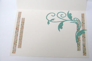
Of course, I had some little strips left over, so I used them to pretty up the inside along with one more die cut.

I am quite pleased with the result. Now I need someone to have a birthday so that I can send it.

I will be back soon, as I have a couple more cards to show off. I hope that this is just the start for me, and that I am back on track.


Thursday, April 26, 2012

Week Four - Just in Time


I have been a little busy since I my last post and am now rushing to get everything done by the deadline (tomorrow) for the Viva la Verve Challenge

Here is the final sketch for April.

.


I started with the same Graphics 45 paper that I used early last month here. The card base is ivory and there is a mat of soft teal (Core-dinations) under the main piece of patterned paper.

I used ivory cardstock and die cut 3 triangles with a Marianne die from a 2-set called Corners. I also cut a rectangle of ivory c/s and embossed it with a Spellbinders Mbossabilites folder - Garden Delight. Then I attached all of this to the card and added the tiny pearls (Stampin'Up!)

I die cut the butterfly from a darker teal shade c/s (Core-dinations). with the SB die, Fanciful Flight. Then I covered a rectangle of clear acrylic c/s (HFC) with a piece of Sookwang tape sheet. The die cut butterfly was attached to this rectangle and I attached pearls to create the antennae, then fussy cut around the butterfly.  I covered the whole thing with a microfine transparent glitter and tapped off the excess. The result is this shimmery beauty. Of course it is hard to capture the shimmer with the camera. The final touch was a variety of sizes of pearls for the body. Then I shaped it and attached it to the card with red tape.

Now all I needed was a sentiment. First, I stamped my words (HFC's new Western Sentiments) on ivory with Color Box teal ink. Then I used  SB Fancy Tags die to cut it out. The teal under layer was cut with the Fancy Tags 2 set. I attached the bottom layer directly to the card, and added the top layer with foam dimensionals. Last, I added the pearls.

Okay, now all I have to do is get all four cards loaded up on the VLV site on Splitcoaststampers.

We are starting to look at the end of our stay here in AZ for this spring. That means packing up and cleaning, then the long drive home. Of course, that is followed by getting organized and acclimatised back in Alberta. So I once again make no promises for any posts for a while. I hope you will all have patience with me.

Meanwhile, get your fingers inky!

Friday, April 20, 2012

Keeping My Head Above Water

Well, the 4th Verve sketch comes out tomorrow and I am just finished #3 on time. Maybe this month I will actually get my act together and get everything posted on Splitcoast Stampers on time.

The third sketch for the Viva la Verve Challenge is as follows:


And here is my card based on the sketch:


I just bought these beautiful papers yesterday and was itching to put them to use. I have never been one to make antique or shabby chic cards but these designs were made for that style. They are from a Kaiser Craft collection called These Days. I rounded the corners on the floral layer, roughed the edges a bit and then distress-inked both layers with antique linen ink.

I cut the adorable floral circle with the Heartfelt die, Layered Scalloped Posy. It is a half circle die so you have to run the paper through twice, moving the die in between. I also inked the edges of the die cut with the linen ink.

The beautiful crocheted lace is from Joann's and I attached it using glue dots. The flowers are by Petaloo and the pearl swirls are Recollections from Michaels.

The oval die cut was made with Spellbinders Floral Ovals set, inked with the linen ink before removing from the die, and attached with foam dimensionals. The sentiment, stamped with tea dye distress ink, is from a Just Rite stamp set called Fancy Labels.

This is such a soft delicate card and I do like it . I may have to try more in this style.